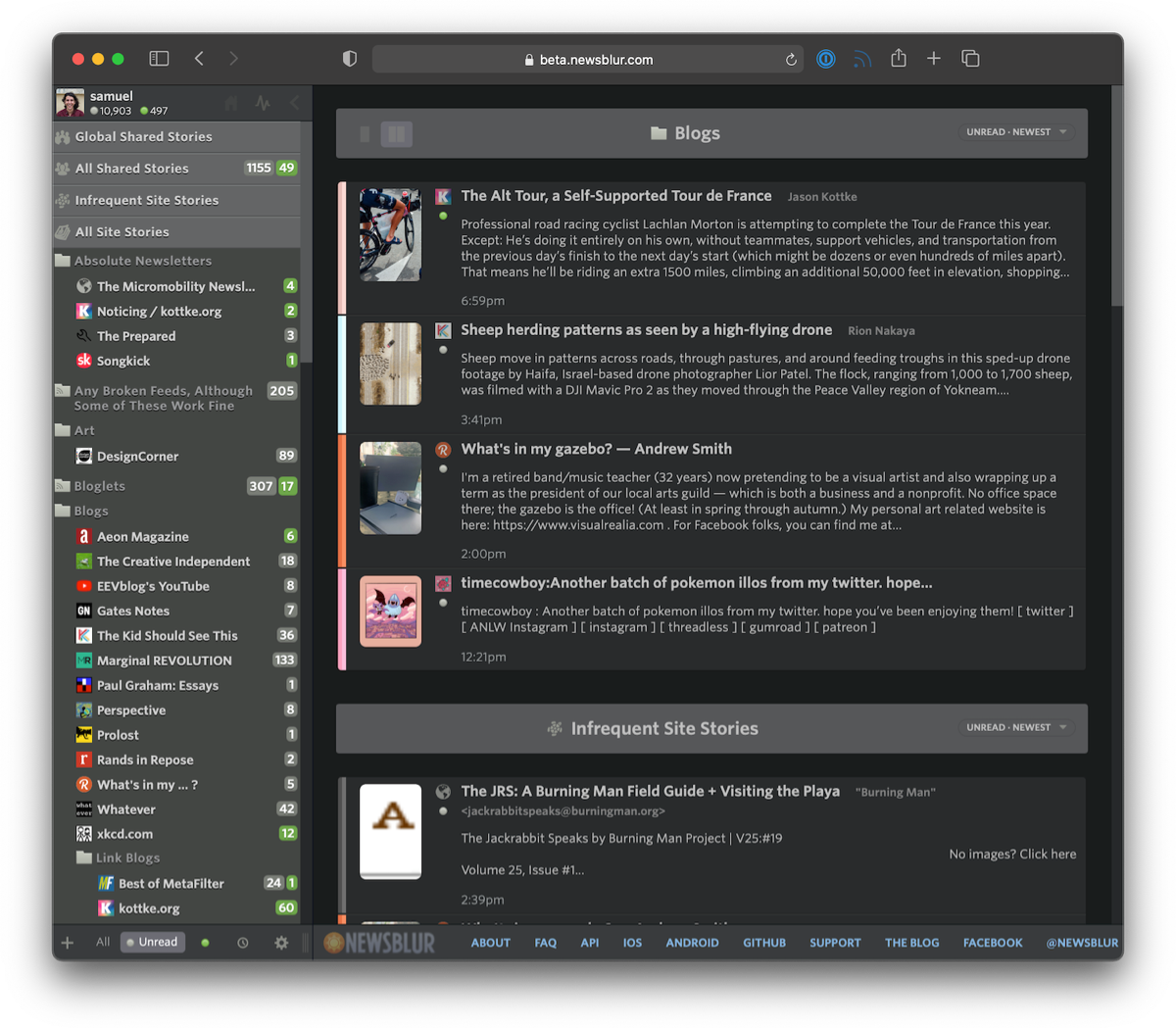
This past year we’ve focused on maintenance and improving quality behind the scenes. It just so happens that the urge to clean is so strong that this work extended to the front-end. After months of work, today we’re launching a redesigned NewsBlur for all three platforms: on the web, on iOS, and on Android. There’s a lot that’s new. And what better day to launch a redesign than on the ninth anniversary of the sunset of Google Reader.
To start, let’s take a look below at the redesigned NewsBlur.

Loads of new features:
- The dashboard now has multiple, customizable rivers of news
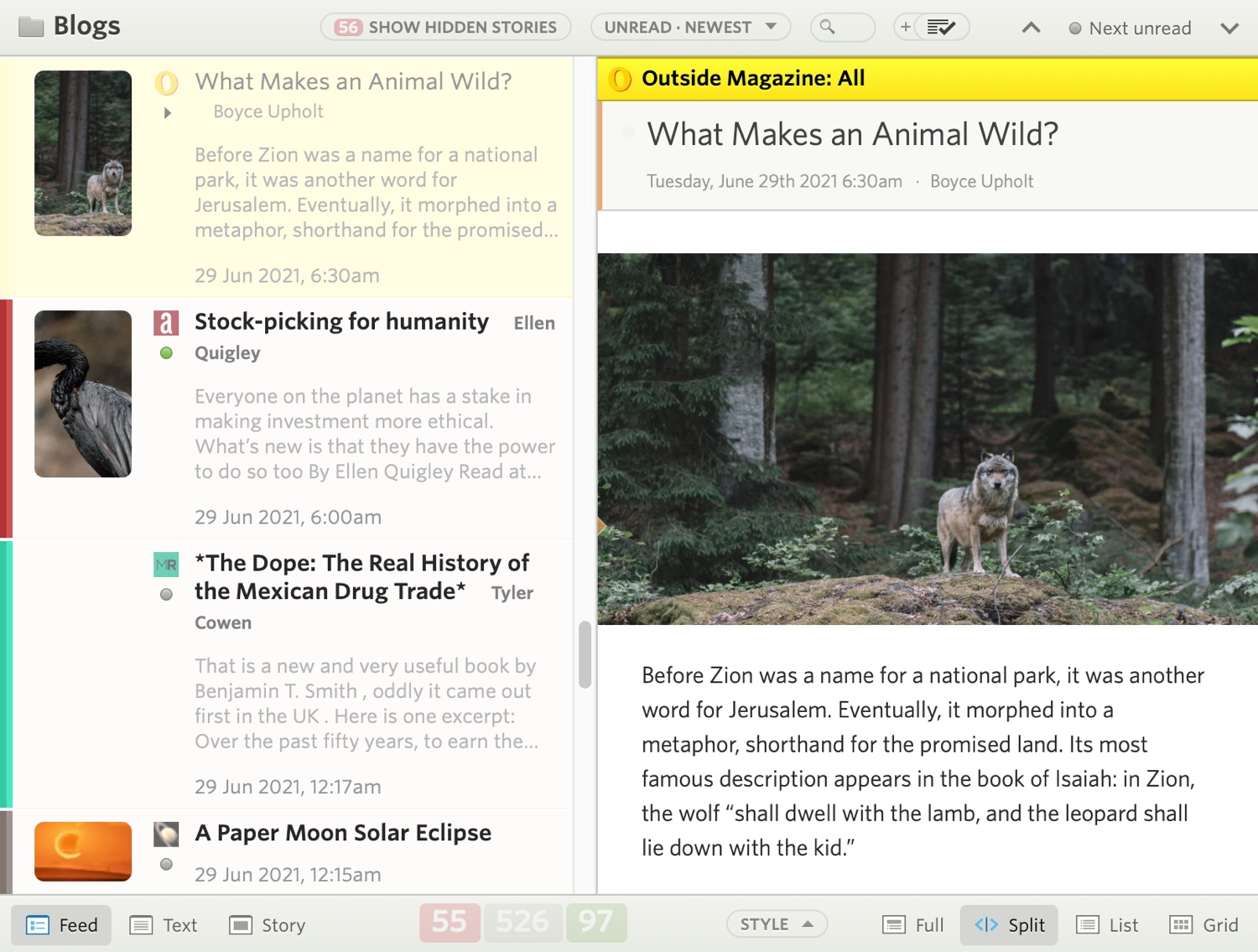
- Image previews are now customizable by size and layout
- Story previews are also customizable by length
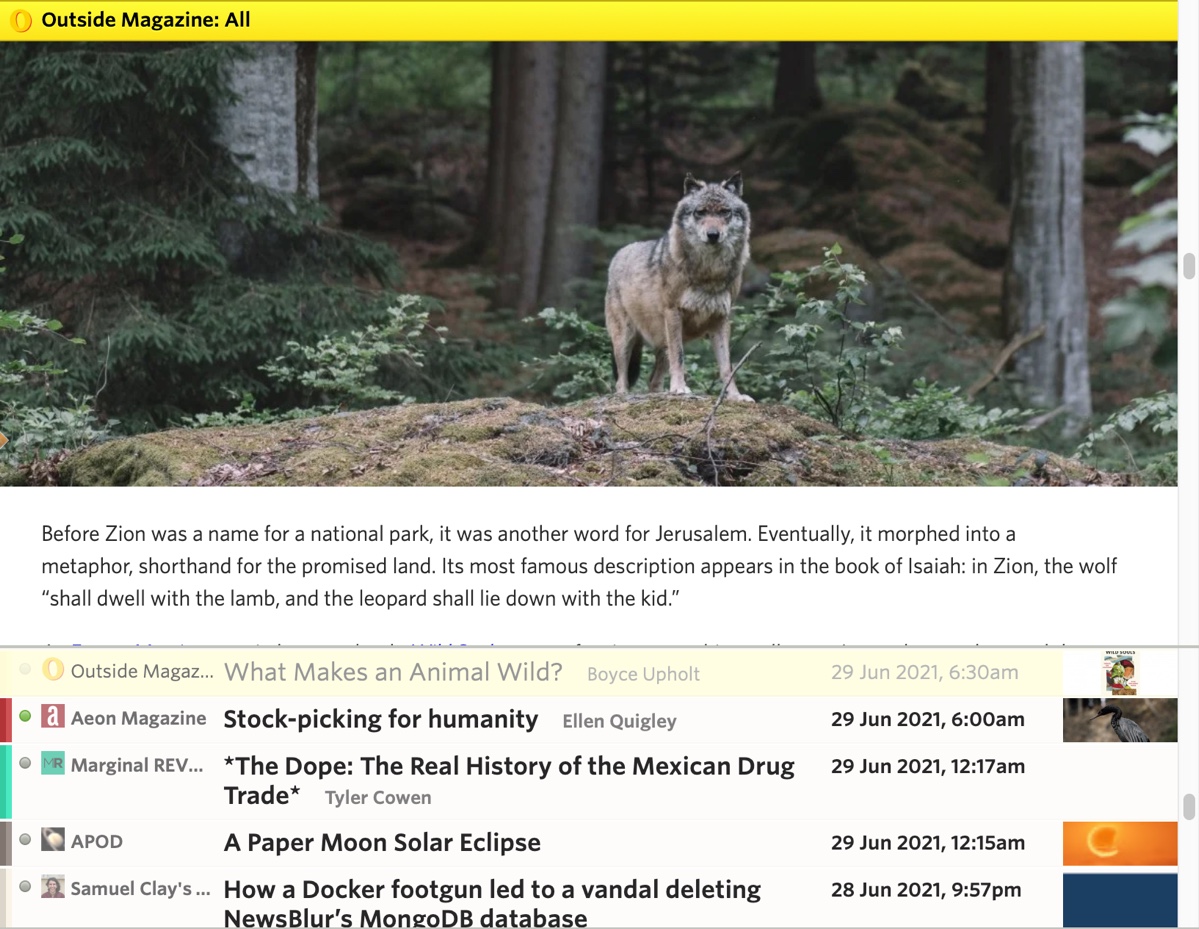
- Images are now full bleed on the web (edge-to-edge)
- Controls have been re-styled and made more accessible
- Sizes, spaces, and text have all been tweaked for a more legible read
- Upgraded backend: Python 2 to Python 3, latest Django and libraries, containerized infrastructure
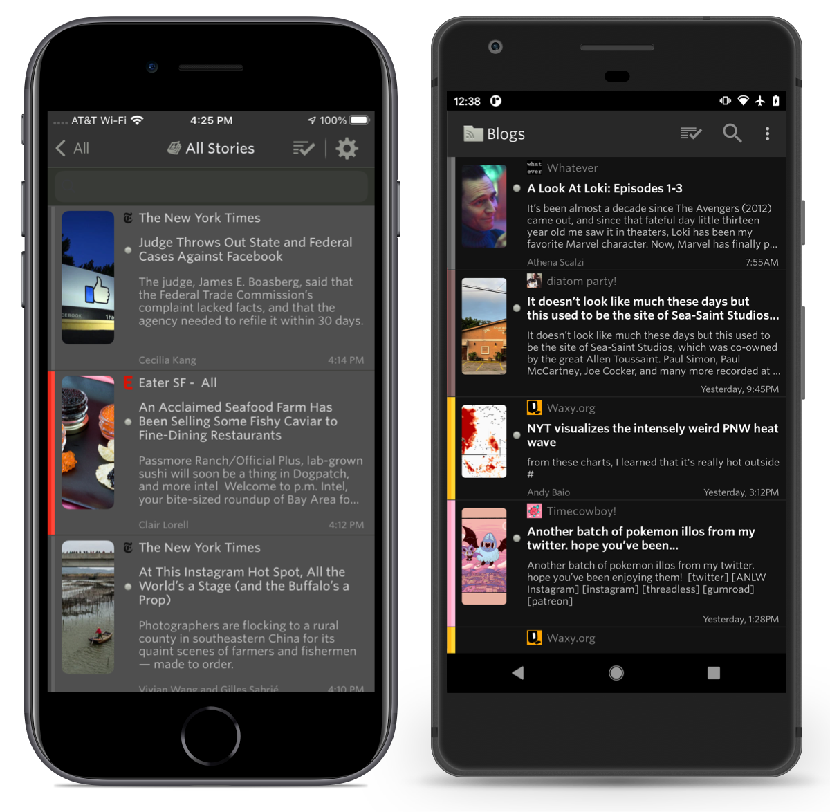
- Both Android and iOS apps have been updated with the new design
Those multiple rivers come in handy when you want to follow different interests at a glance. You can of course change which individual feeds or folders is loaded, letting you focus on saved searches, infrequent stories, a single feed, or everything you’re subscribed to.
Below you can see the design in action. Notice how easy it is to change where the image preview is located as well as adjust the number of lines of story text to show.
The reading experience itself has also seen improvement. Full bleed images have been ported over from iOS to both Android and the web. This means that images will now run edge-to-edge. And the controls at the top and bottom of the web app have been restyled to be easier to understand at a quick glance.

There’s many ways to adjust story titles to fit. Pack them in dense or offer titles room to breathe.

The redesign has also come to both of the official Android and iOS apps. Right now both are in beta testing, but you can join the iOS TestFlight or the Android beta.

This whole redesign weighs in at a whopping 1,316 commits, which you can view on GitHub. Much of the work that took place here involves upgrading from Python 2 to Python 3 and containerizing everything with Docker. In a few weeks, we’ll post a technical writeup of what those backend changes are and how you can now run a local version of NewsBlur on your own computer with a single line of code. For those that want to run their own private instance of NewsBlur, that line of code is make nb and instructions are found on the repo.
If you’ve enjoyed using NewsBlur and are a fan of this grand redesign, please take a moment to share on social media that you read your news with the help of NewsBlur.


 Saving the world is serious business What better way to memorialize Link for all the hard work he has done over the years then to capture his image in a stained glass window. And then capture that window on a shirt for all your friends to see. $19.99